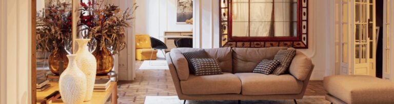
For many decorating your home in simple, relatively neutral colours was the done thing and moving away from that tried and tested regime to something more daring and imaginative was a horrific thought. How on earth do you go about ensuring that the colour scheme you have chosen actually makes sense? Well, this is where the colour wheel comes in so save the day. Of course, it isn’t as simple as just picking any colour on the wheel and it automatically matches. In this article we will take a look at how to use the colour wheel when choosing your interior colour design.

What is the colour wheel?
Believe it or not, the colour wheel as we know it was first invented by Sir Isaac Newton back in the 1600’s whilst using a prism to split light into its component colours. In 1704 he published Opticks which had the first colour wheel. Modern colour wheels are split into 12 different hues made up of the primary colours (Red, Blue and Yellow), secondary colours made from mixing the primary colours (green, orange and purple) and then tertiary colours made from mixing the secondary colours with primary colours. Each segment of the wheel is then split into shades of each colour from dark to light. The colours are classed as warm (Reds, Oranges and Yellows) and cool (Lilacs, blues and greens) and also categorised into harmonious, contrasting and tonal groups.
Harmonious Colours
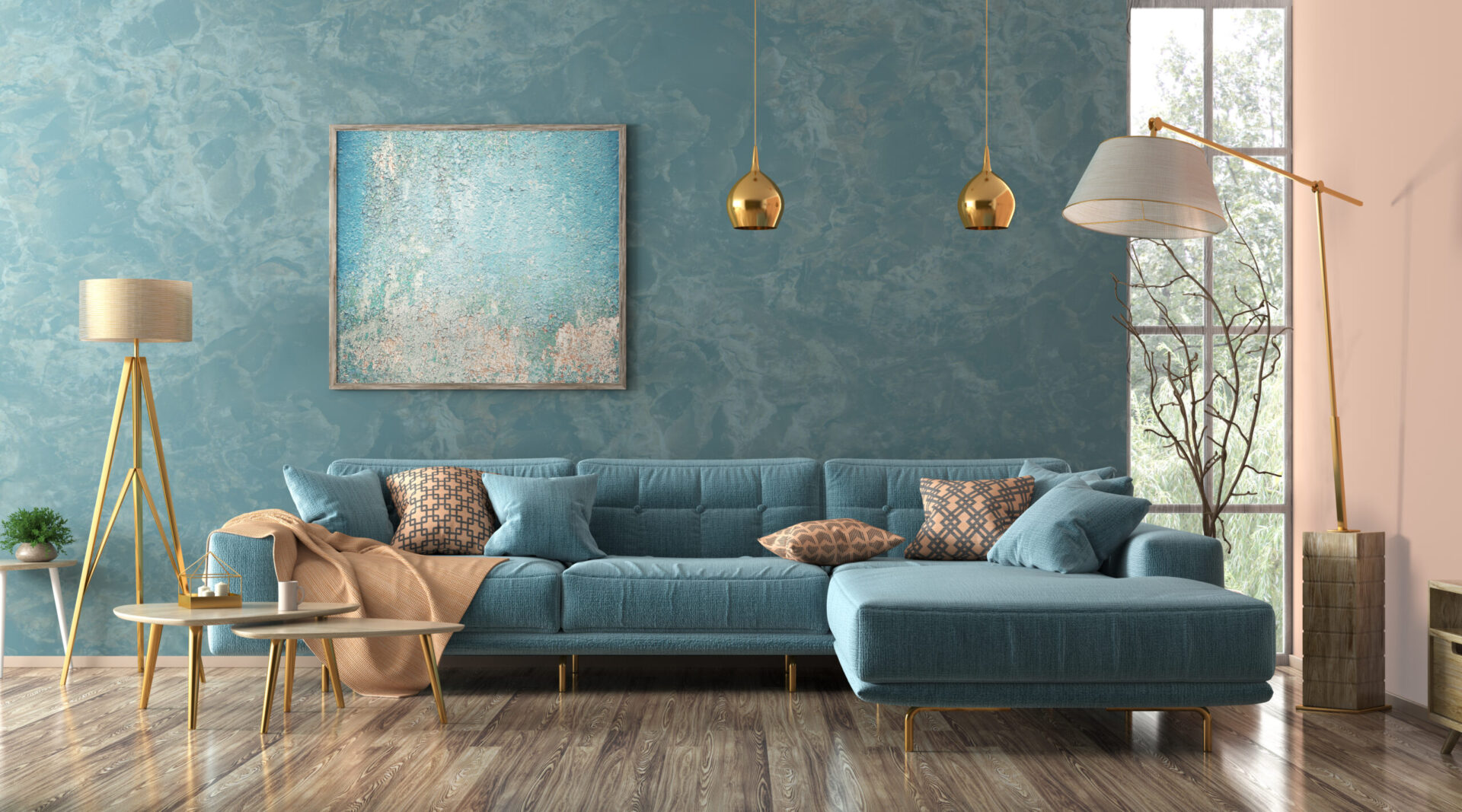
These are colours that sit next to each other on the colour wheel and are subtle variations on a theme. Typically, you would choose 3 complementary colours for a colour scheme and use the 60:30:10 rule to determine the percentages of each colour used. Choose your dominant colour and use this for 60% of the space on walls, ceilings or large rugs. Take your second colour, which acts as an accent colour and use it for bedlinen, curtains and furnishings. The last colour is then used for things like cushions, picture frames and other smaller accessories. Just remember that the colours need to be next to each other on the wheel.
Contrasting Colours
Contrasting colours are ones that lie opposite each other on the wheel, this is also called a complementary colour scheme. You can choose to paint your walls in two different colours or have your walls in one colour and your main furniture in the contrasting colour. You can use this colour scheme to create room sections by painting the two sectioned areas in different colours. To create accents, use the split complementary colour scheme. In this scheme the dominant colour is combined with the two colours which lie next to its directly opposite colour on the wheel. This really does open up the way in which you can use colours in any given room. As with the harmonious colours, you can create a vibrant and contrasting scheme using the split colour scheme.
Tonal Colours
Tonal colours are the same colour, but of differing shades or tones. These are perhaps the simplest to get right but can also give a really classic look and feel to a room. If you have a picture or dado rail for example, you can paint one side of the rail one tone of the colour you have chosen and the other side a different tone to give a really classy and subtle extra dimension to your colour scheme.
Putting together a colour scheme that works is not as scary as some people think and by following some simple rules you will be able to create some fantastic colour schemes in your home, so get yourself a colour wheel, choose your dominant colour and let your imagination run wild.